Blue is an extremely versatile and popular color in professional environments and in web design. Culturally, and depending on the shade and the context of its use, blue can mean:
It is also a color that is often associated with the sky and water, which are both avenues to spirituality in many cultures. When blue dominates an image or piece of art, it can also create feelings of depression and sadness. However, when used selectively in office environments, blue has been shown to increase productivity and creativity in people that work in rooms decorated with the color blue. Notably, blue is also one of the most popular colors in the world. In today's world of rapid information processing via image and color, it's important for web designers to choose colors that are immediately likable to the general public-- hence, many, many things on the internet, either in website design or logo design or in advertising, are blue. In Western culture today, and now in web design and other professional environments, blue is often used to convey a sense of trust and stability. It's often used by official entities that need to gain the public's trust, such as police, health insurance, hospitals, car insurance, government offices, and banks. Given this connotation, blue is also used by newer companies and websites that are trying to build a reputation for themselves and gain the trust of the consumer. So, how can we use blue in web design? Let's take a look at some examples.

The meaning of the color blue can vary wildly by the shade you choose to use in your design. Here, a dark, saturated blue is used to convey a sense of trust and reliability. This makes sense, given that Blue Cross Blue Shield is a health insurance company. When dealing with peoples' health, and attempting to build trust with your customers, you want to use colors that convey stability and reliability. The message is clear: buy insurance from us! You can rely on us to take care of you when you need it most.
Blue Cross Blue Shield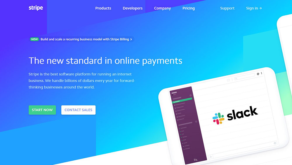
Although blue is a lovely color, you should not design a website that is completely reliant on the color blue. Blue is a very popular color, and it's important to use it sparingly, so it draws the eye, and the site is still easy to read. Here, the color blue is used by Stripe, a new company whose software manages business financials on the internet. The heading of their website uses blue in combination with other colors: white and green. Green symbolizes good fortune and growth in the West, but it also breaks up the color blue here and makes the image more pleasing to the eye, while the white sections provide definition and make the text very readable.
Stripe.com
Once again, shades of blue come into play in this logo from Net Nation. Although too many shades of blue used improperly could suggest sadness, the designers for Net Nation were careful to use shades of blue on the turquoise side of the spectrum, which is more uplifting and suggests refinement. (Think French aristocrats, Impressionist paintings, Tiffany boxes). When used in this context on a clean background, this logo reads as refined and professional while being pleasing to the eye.
Net NationHere are some sources that I used to bring this site to life:
Fun Fact!: Although the islands of Greece are surrounded by the blue Meditteranean Sea, ancient Greeks did not have a word for the color blue. In Homer's Odyssey, things we would normally associate with the color blue, like the sea, are described as "wine-colored." In human language, people have always been able to see the color blue, the word for it usually doesn't develop in human language until much later, usually after the words for black, white, red, green and yellow! This is because blue does not naturally occur in nature, except in the sky and in large bodies of water.